Notion Charts: A Game Changer for Data Visualization in Notion

Notion has long been a favourite tool for knowledge workers, project managers, and creatives, thanks to its versatility and ease of use. I personally use it as my Second Brain; to capture, organise, distil information and express or share that information in multiple ways.
From note-taking and project management to databases and wikis, Notion’s all-in-one workspace has become a staple for individuals and teams alike. However, one of the most requested features over the years has been the ability to create and display charts directly within Notion. That request has finally been answered with the launch of Notion's new charts feature—a powerful addition that promises to revolutionize how users interact with and visualize data.
What Is Notion's New Charts Feature?
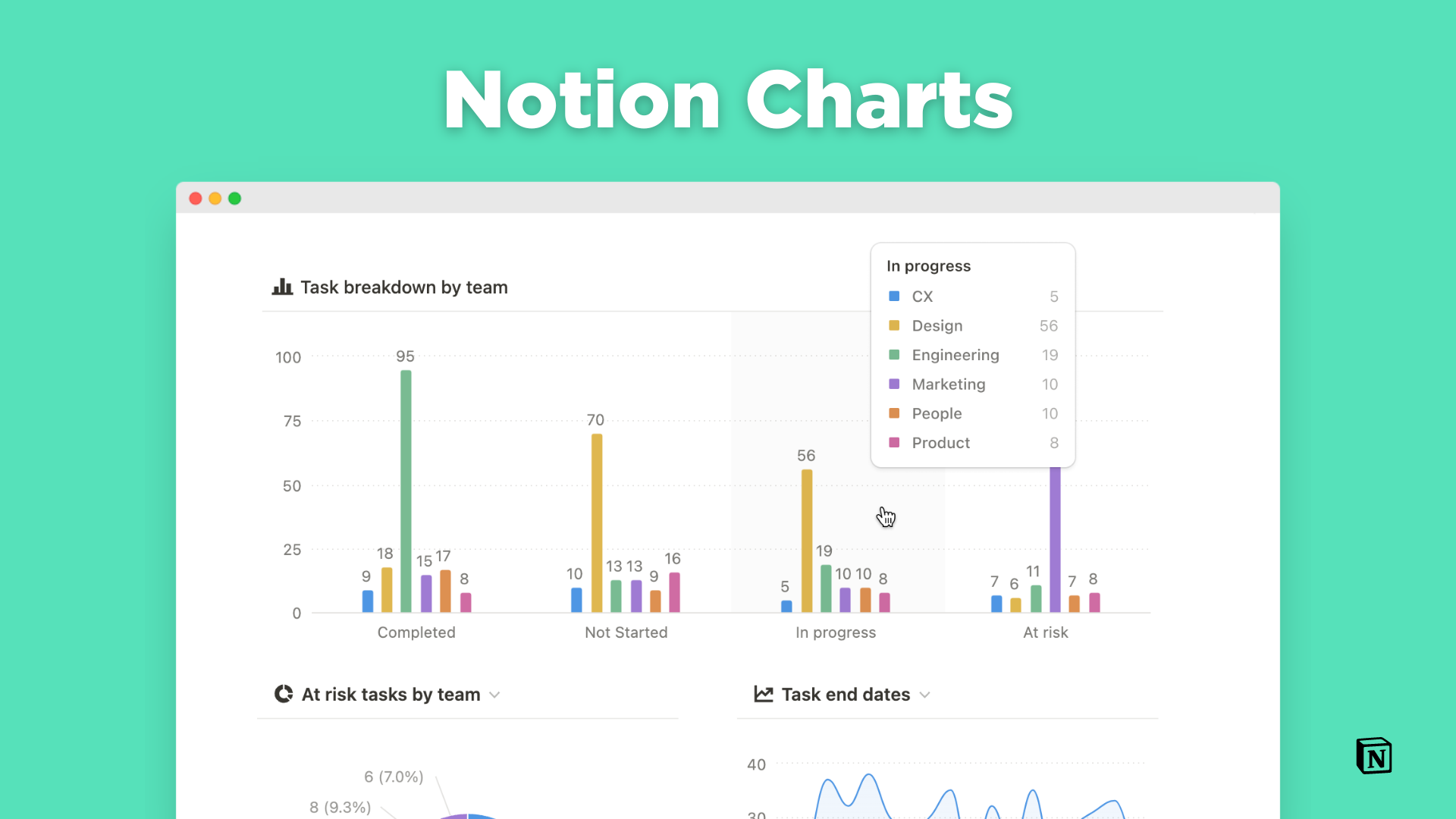
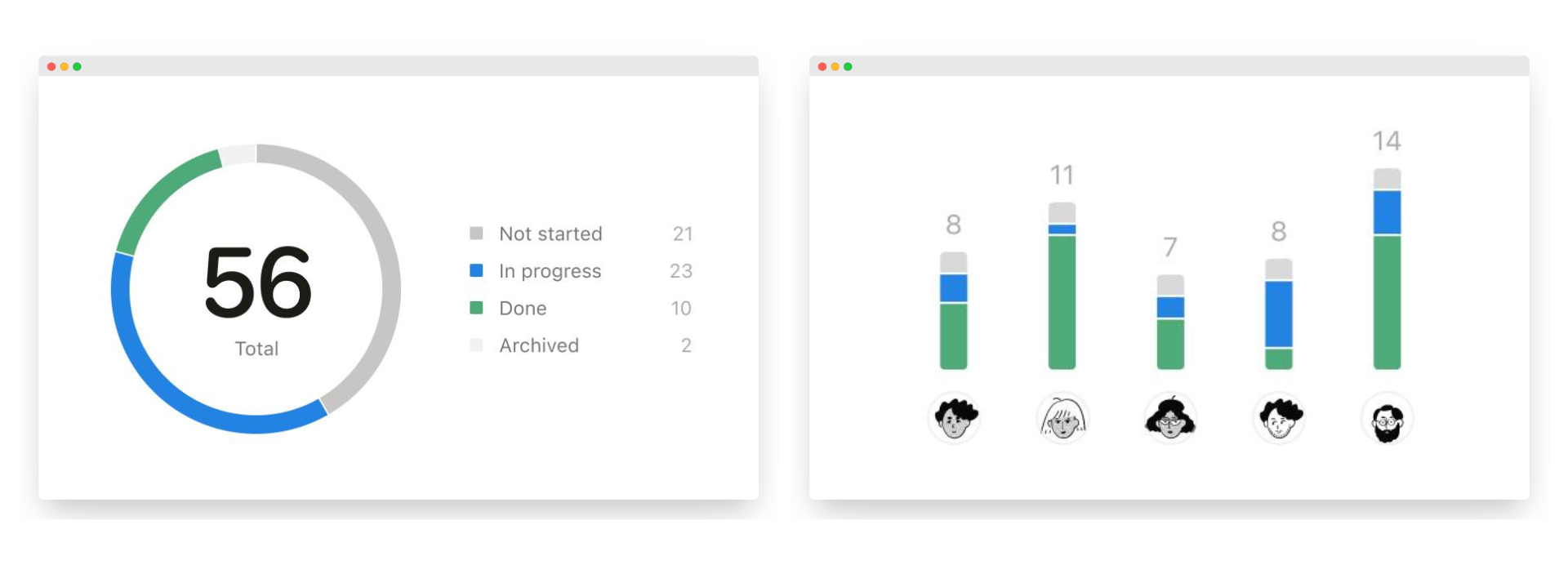
Notion's charts feature allows users to create visual representations of data directly from Notion databases within their workspace. The feature launched with three chart types; bar charts (horizontal & vertical), line charts, and donut charts. Users can create charts using data from Notion's native databases, enabling real-time updates and making it easier than ever to analyze and visualize complex data sets present in a visually compelling way.
The integration of charts into Notion's ecosystem is designed to be seamless, allowing users to create and customize charts without needing to rely on external tools or complicated workflows. Whether you're tracking project progress, analyzing survey results, or managing budgets, Notion's charts provide a dynamic and interactive way to make sense of your data.
Key Features and Benefits
- Ease of Use:
Notion’s charts feature is designed with simplicity in mind. Users can easily create and customize charts without needing advanced technical skills. The intuitive interface makes it accessible for beginners while still offering depth for power users. - Diverse Chart Types:
Notion offers a variety of chart types to cater to different data visualization needs. This variety ensures that users can choose the most appropriate chart type for their specific data set and analytical needs. These include:- Bar Charts: Ideal for comparing different categories of data.
- Line Charts: Perfect for tracking changes over time.
- Pie Charts: Useful for showing proportions and percentages.
- Integrated Data Visualization:
Users can create charts that are directly linked to their Notion databases. This integration means that any changes in the database are automatically reflected in the charts, ensuring up-to-date visualizations. - Real-Time Data Updates:
Charts in Notion are linked directly to your databases, meaning that any updates to the data are reflected in the charts in real-time. This is a game-changer for teams working on collaborative projects, as everyone has access to the most up-to-date information, ensuring that decision-making is based on the latest data. - Customization Options:
Notion’s charts come with a range of customization options, allowing users to tailor the appearance of their charts to match their branding or aesthetic preferences. Users can adjust colours, labels, and data points, ensuring that the charts not only convey the right information but also look great within their pages. - No Need for External Tools:
Before this feature, users often had to rely on third-party tools like Google Sheets, Excel, or Notion-based data visualization platforms like Notion-Charts which then had to be embedded back into Notion. This workflow was not only cumbersome, but also disrupted the seamless experience that Notion aims to provide. With the new charts feature, everything can be done within the platform, saving time and reducing the complexity of managing multiple tools. - Real-Time Collaboration:
Just like other Notion elements, since charts are linked to databases, they can be shared and collaborated on in real time. This is particularly useful for teams who need to analyze data together and make informed decisions quickly. - Enhanced Reporting:
For users who rely on Notion for project management and reporting, like myself, the ability to create charts adds a new dimension. Charts can be embedded into project pages, reports, and dashboards, providing clear and compelling visual data insights.

Possibilities for Notion Users
Notion is widely used by multitudes and some of these include; project managers, data analysts, educators, students, business owners and many others. The introduction of charts in Notion has several far-reaching implications for how these users can leverage the platform.
- Enhanced Data-Driven Decision-Making: With charts now available directly in Notion, teams and individuals can make more informed decisions by visualizing data trends and patterns without leaving the platform. This is particularly useful for project management, where tracking progress through visual means can highlight potential issues before they become major problems.
- Streamlined Project Management: Project managers can now create comprehensive project dashboards that include timelines, task lists, and charts showing project metrics like completion rates, budget usage, or team performance. This holistic view can improve project oversight and ensure that all stakeholders are aligned.
- Improved Reporting: Notion users can now create dynamic reports that include charts alongside text, images, and other content. This is invaluable for creating client presentations, internal reports, or any documentation that requires both narrative and data visualization.
- Personal Productivity Boost: Individuals using Notion behind this feature for personal productivity can now track their own goals and progress in a more visual way. Whether it’s tracking habits, finances, or project milestones, charts provide a clear visual representation that can help users stay on track and motivated.
- Educational and Training Use Cases: Educators and trainers can use the charts feature to create engaging and informative content. For instance, charts can be used to visualize data in lesson plans, track student progress, or create interactive training materials.
- Business Intelligence Integration: For businesses, the ability to integrate data visualization directly into Notion opens up new possibilities for business intelligence. Companies can now use Notion as a lightweight BI tool, combining it with other integrated apps or API connections to pull in external data, visualize it, and make data-driven business decisions.
Getting Started with Notion Charts
Notion has made creating and customizing charts in Notion pretty straightforward. You can follow these 3 simple steps:
- Creating a Chart: To create a chart, users simply need to add a new block to their Notion page and select the “Chart” option. From there, they can choose the type of chart they want to create and link it to an existing database. They can also add chats directly into a database by selecting a different view.
- Customizing the Chart: Once the chart is created, users can customize it by selecting different data points, adjusting the appearance, and adding labels. Notion’s user-friendly interface makes this process straightforward.
- Embedding Charts: Charts can be embedded into any Notion page, allowing users to place them within reports, dashboards, or even within personal journals. This flexibility ensures that charts can be used in a variety of contexts.
It is important to note that charts can best be leveraged by users on the paid plan (even for the least paid plan). Users on the free plan can only access one chart.
Notion Charts in Action
This use case by August Bradley is one of my best application of charts in Notion. Leveraging his “Pillars, Pipelines & Vaults” system thinking approach, August showcases the most extensive application of charts in a fully Notion-based Life Operating System, visualizing the necessary data for decision-making and providing actionable insights from a system built with multiple interconnected components.
The launch of the charts feature in Notion marks a significant enhancement to an already powerful tool. By bringing data visualization directly into the Notion workspace, users can now gain deeper insights and communicate information more effectively. Whether for professional, educational, or personal use, the new charts feature opens up a world of possibilities, making Notion an even more indispensable tool for millions of users worldwide.
As Notion continues to evolve, the charts feature represents a major step forward in its mission to be an all-in-one workspace. For users, this means more streamlined workflows, enhanced productivity, and the ability to make better, data-informed decisions—all within the familiar and flexible environment that Notion provides. Whether you're managing complex projects, analyzing data trends, or simply tracking personal goals, the new charts feature is sure to become an indispensable part of your Notion toolkit.
